
Driving User Engagement with Streamlined, Accessible Insurance Tools
Nobody wakes up wanting to learn insurance
Here's the truth about insurance: people only think about it the moment they desperately need it. And in that moment, they want answers, not a vocabulary lesson.
HelpInsure.com already had every answer a Texan could need. It just hid them well. The information was all there; a confident decision was not.
Understanding the Audience
Two groups paid the price:
The customer service team burned hours hand-walking callers through a site that should've walked them through itself.
And the public hit a wall of jargon, then hit a second wall when they couldn't even figure out how to contact the provider they'd finally picked.
Designing Around Real Questions
I stopped designing around insurance and started designing around the questions people actually showed up with:
Which one is right for me?
Why do these cost different amounts?
What am I actually getting?
The site's greatest hits of friction
I audited the content and the legal must-haves, then talked to the people fielding the confusion. The pattern was everywhere. Even the "helpful" metrics, like complaint scores, were quietly making things worse.
Navigation that didn't navigate.
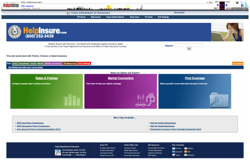
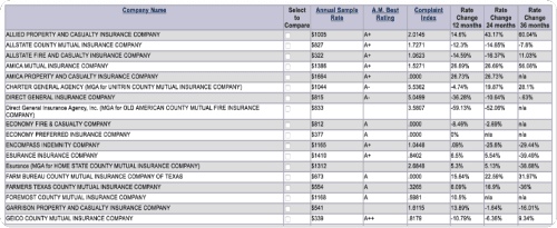
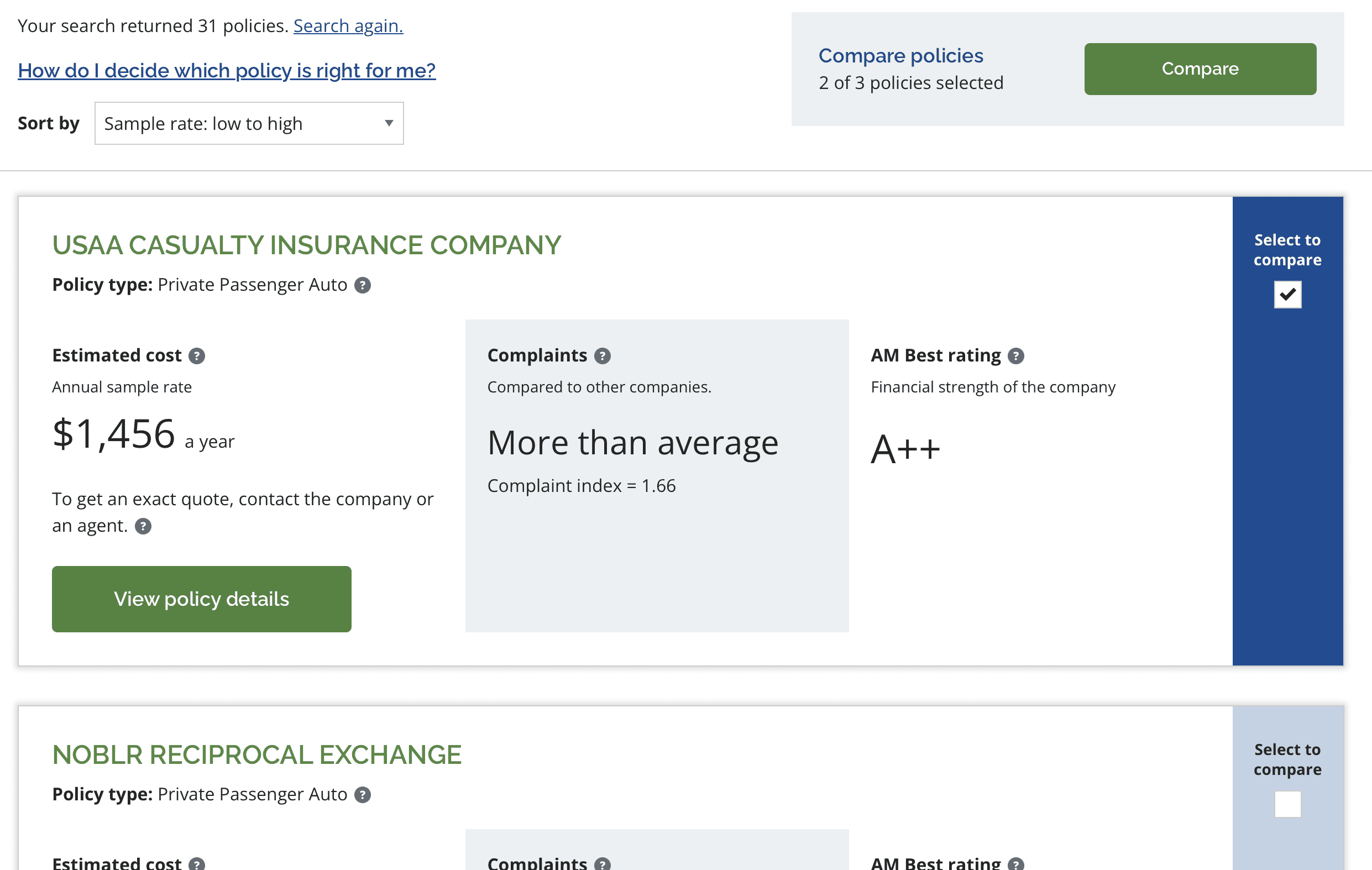
Quotes dumped into a spreadsheet that just sat there.
Language written for actuaries, but read by everyone else.
Collaboration and Iteration
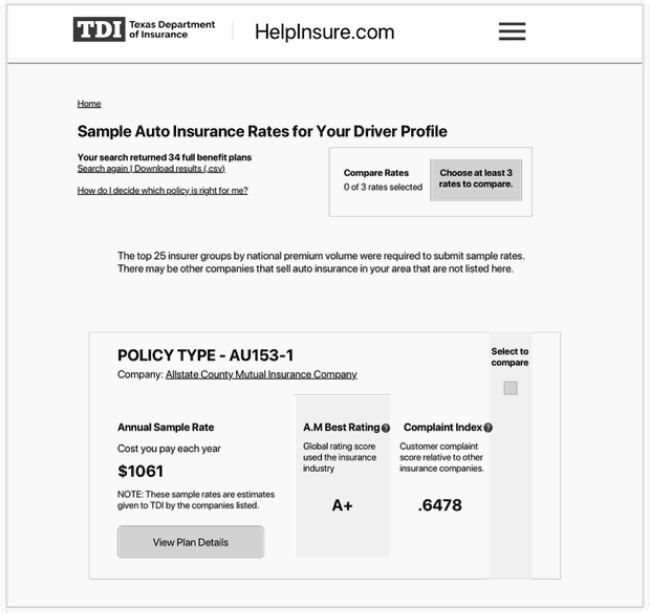
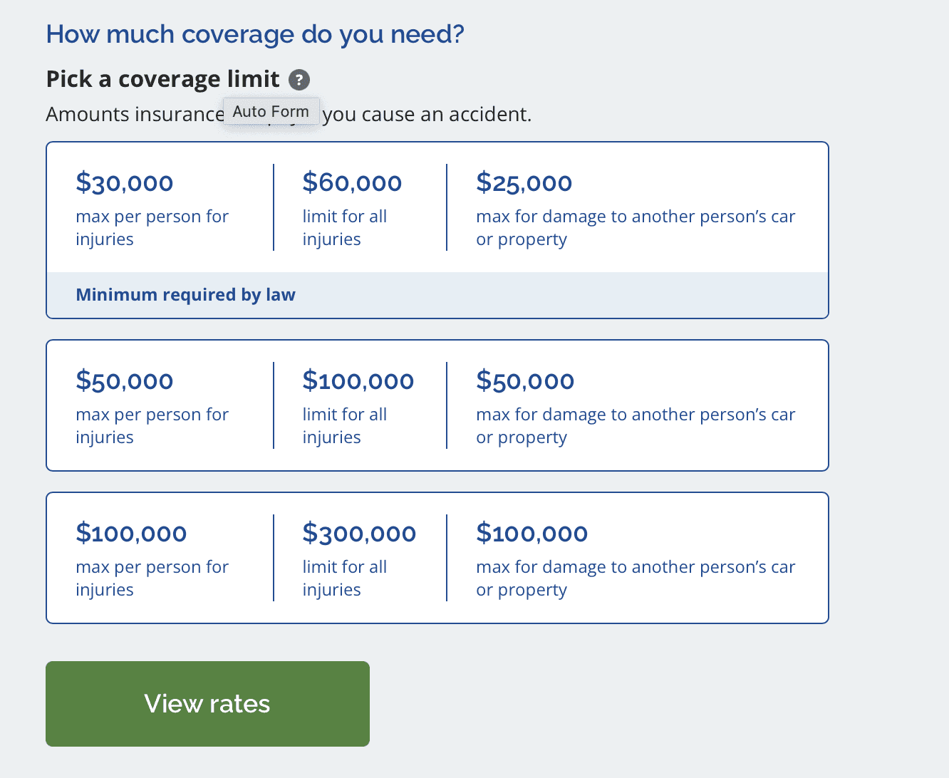
I developed preliminary wireframes to map the site’s user flow and interactions. Collaborating with the product manager, internal stakeholders, and team members, we refined the designs through several iterations to ensure clarity and usability. Examples of key screens are shown below.

What came out the other side:
Better navigation with clearer labels .
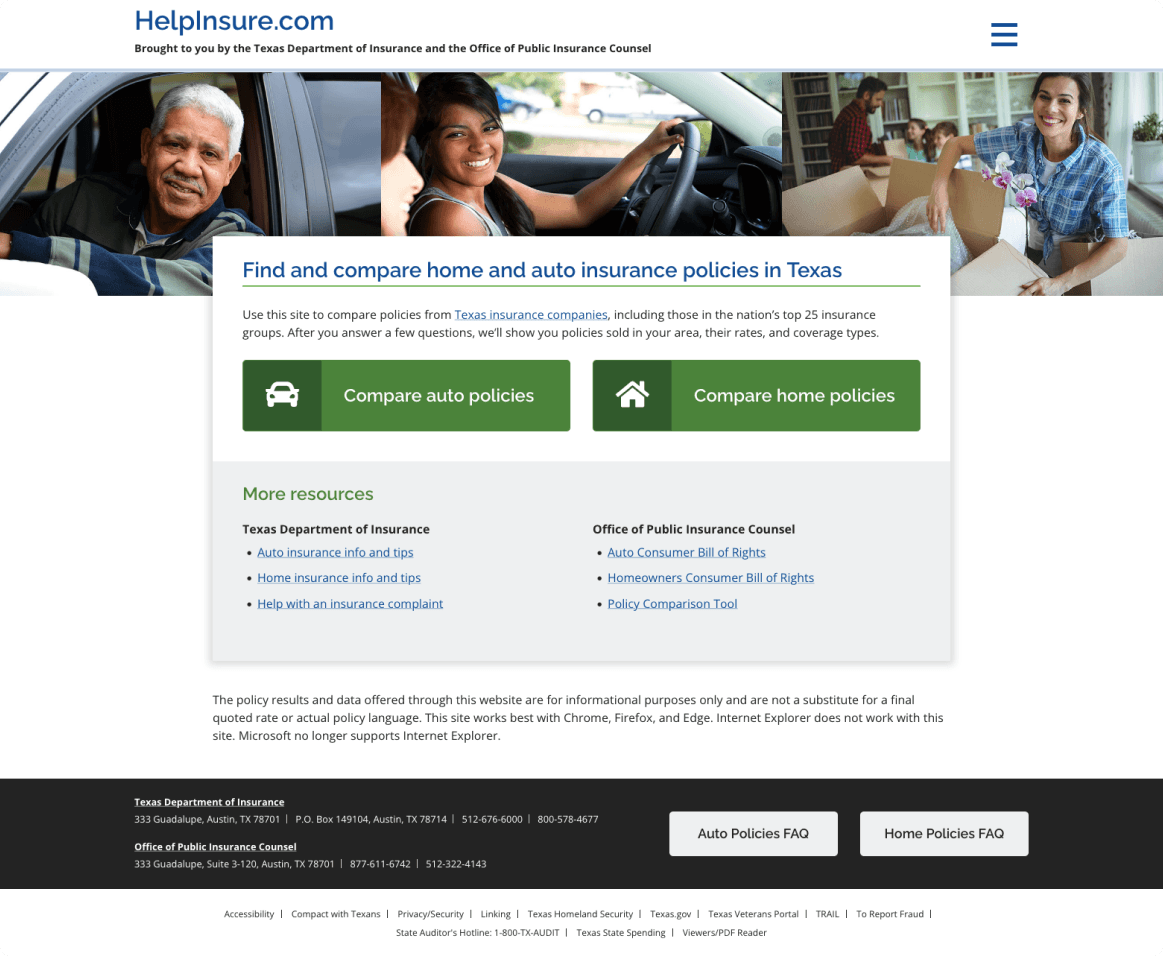
Cards instead of spreadsheets, so comparing felt like comparing.
And plain language, accessibility first, written for the human who's stressed and just wants to choose.
The Outcome
The customer service reps noticed immediately. Guiding callers got easier because the site finally did its share of the work. Stakeholders were thrilled, especially to see clarity and accessibility leading the redesign for once..
Visit the live site: HelpInsure.com
Next project: Symphio
Mighty Citizen
—
2021
Driving User Engagement with Streamlined, Accessible Insurance Tools.