SXSW INTERACTIVE
Case Study: Making key improvements to the core functionality of an existing app.

The Challenge
SXSW Interactive is one of the premier interactive events in the world. Yet their app gets low reviews every year from interactive festival attendees. The objective was focus on making key improvements to the core functionality of the existing app.
Timeline:
2 week design sprint
My Role:
We worked in a team of 3. I was the Researcher, Designer, and Information Architect
What I Did:
User Surveys
Competitive Analysis
Journey Mapping
User Flows
Prototype
Usability Testing
Methods Used:
User Interviews
User Journey
Task Analysis
Scenarios/User Flows
Sketch Prototype
Design Thinking and Approach
We used the Double Diamond method for our design approach. This method helps to understand the user, what their needs are, and gives us direction to explore creative solutions to the problem.

Research
Before digging into the redesign, it was important to understand who the primary user was and discover the root of the problem. I started by collecting data from reviews on the Apple App Store to see what users were saying about SXSW GO. There were a total of 196 reviews with an average rating of 3.1 out of 5. Through the data, we obtained a high-level understanding of how users wanted to interact with the app. It also helped us build empathy toward the user and their frustrations as we started the project.

Competitive Analysis
I reviewed 3 other competitive apps which were built for large scale festivals and also held events in multiple locations throughout the city. This gave me an insight into existing mobile patterns, how certain pain points were addressed, as well as ideas to begin brainstorming designs.

User Interviews:
In addition to sorting through all of the App Store reviews, I also interviewed 5 people who used the app extensivelyg when attending SXSW. A few of the questions I asked were:

Affinity Mapping:
We created an Affinity Diagram using data from both the app reviews and interviews to synthesize the results.

Some themes we discovered were:

User Persona
Since we now had a clearer picture of some of the pain points for the end-users, we created a persona to redesign for.

User Journey Map

Tom’s Problem
Tom wants to make the best use of his time while attending SXSW Interactive. He needs a way to find, schedule, and map his route to the sessions he wants to attend.
Conceptualization and Design
Based on the insights gathered from our research, we were ready to hone in on 3 specific features to improve on the interactive portion of the SXSW GO app:

Feature Prioritization
Multiple solutions were explored to address the issues users voiced they were having. After several rounds of paper sketching, it was clear that a well organized, easy to read dashboard would be paramount to how users navigated the content. Creating multiple pathways to find events through the app was something we also challenged ourselves to design.

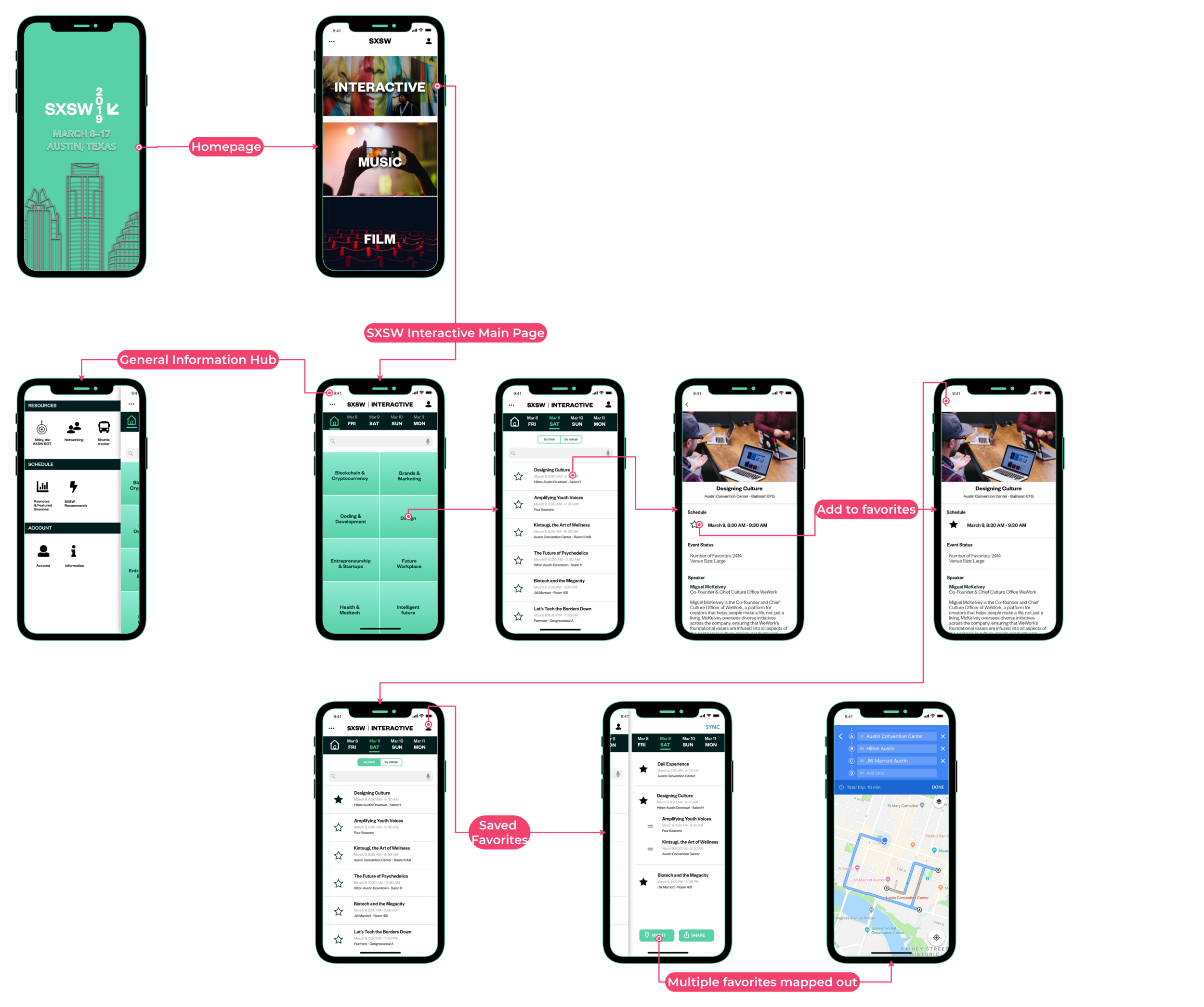
Sitemap

Explored Solutions
With multiple days of sketching and design sessions, we felt like we were nailing down worthwhile solutions that addressed our persona’s problem.

Events could be filtered by category day, time, and place.


A personalization/ favorites page would be easily accessible from the dashboard, and include a mapping and sharing feature.
Users would have a way to prioritize their “favorited” events that overlap in same time slot, allowing them to map their route for the entire day.
Usability Testing and Iteration
We had 3 users test a prototype. The task was to favorite an event at 8am on Saturday, then go to view your favorites and map those events. All 3 users were able to complete the tasks, however we discovered some areas to iterate on, which would’ve make the tasks easier to complete:

The Grid icon on the top left was changed to a home button, because users thought it resembled a calendar.
The sort by “place” button was changed to sort by “venue” to be more specific.